TOP 10 // INTERIOR PAINT COLORS

Let's talk COLOR! We're excited to see more of the statement-making color trends that we admire around the world make their way into our local mercantile, neighborhoods, and client homes. Gathering inspiration from around the globe and color wheel, our team has created this rainbow of ideas for your next project. We're inspired to create bold and beautiful spaces for our clients, and we hope that you feel empowered to show off your bright side (or moody or soft sides), too!
Before you go covering your walls in these gorgeous paints though, keep these logistics in mind… From walls and millwork to cabinetry and doors, color can completely transform a space and evoke emotions in the design experience. That experience of color is unique to each person who sees it because we all see color a bit differently. As beautiful as color may be, it can get complicated when opposing views of a shade live under the same roof. Just as perceived hues can vary person to person, so can the shades vary room to room. Space, lighting, and shadows can affect the color of color, so for the perfect paint always swatch in your space before you buy. Now break out of your comfort zone with some of these exciting tones!
Go-to paint brands -Benjamin Moore, Dunn Edwards, Farrow & Ball
1. RADIANT REDS
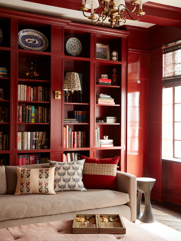
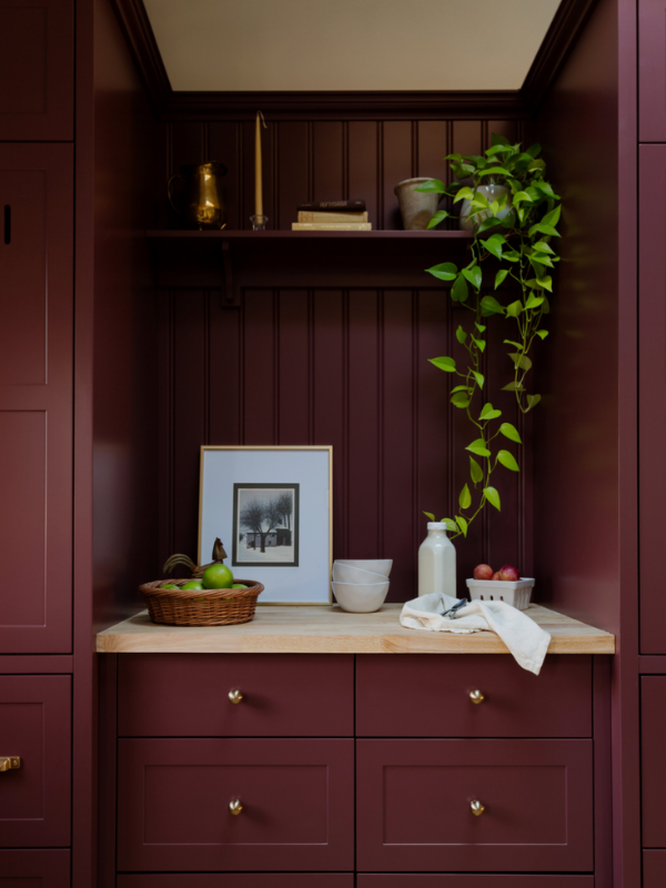
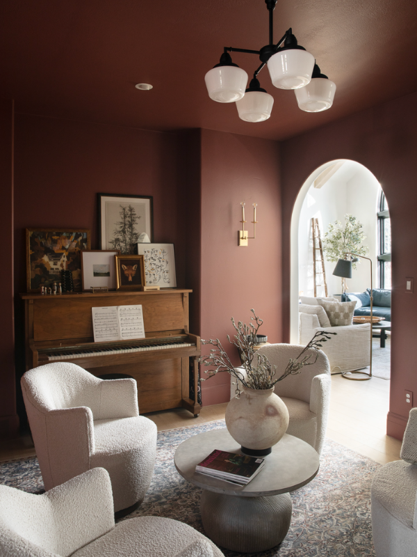
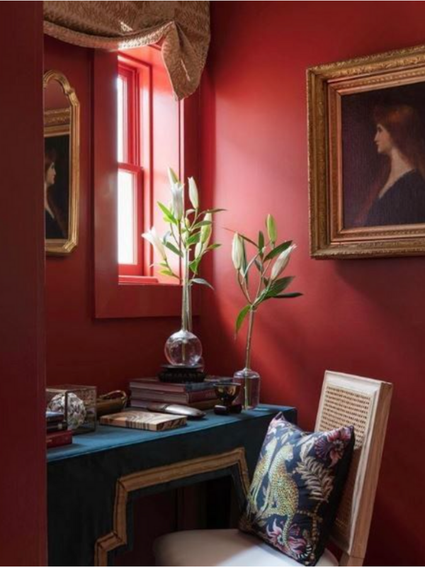
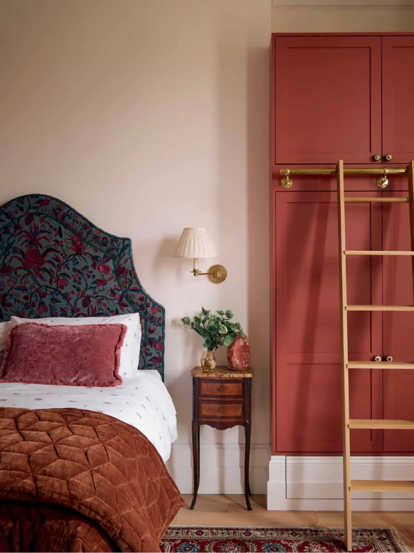
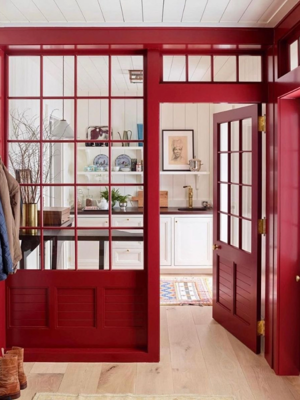
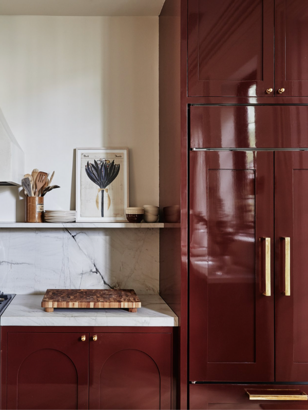
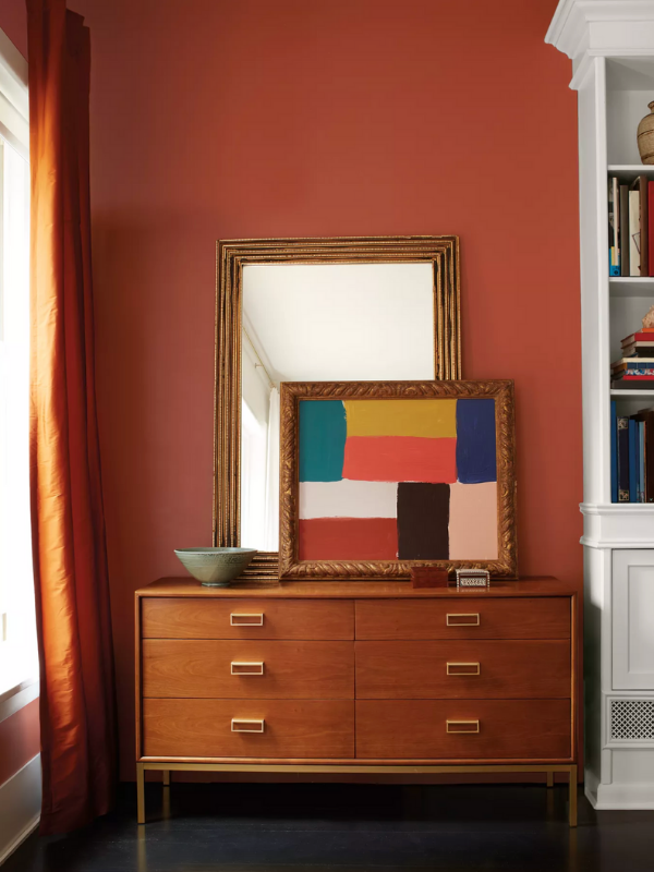
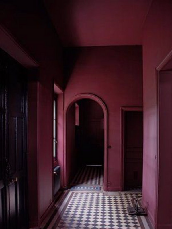
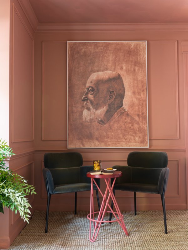
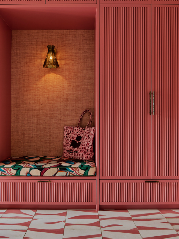
Kicking the colors off in rainbow order… First up we have red! There's no doubt this bold and striking shade stands out, creates drama, and leaves a lasting impression. Its vibrant character can be intimidating, but the designs showcased above prove that all kinds of red are ready to be the backdrop of beautiful memories made at home. Red lives across the color wheel from green which naturally makes it a contrasting and complementary pop of color to the ever-so-popular leafy earth tones. In a traditional setting, red can create an elegant atmosphere and give that classic red lip confidence. In modern design, accents of red can add excitement and energy to the more neutral elements. Farrow & Ball's Color Curator Joa Studhlome recommends using the loud and proud hues of red (think scarlett, crimson, poppy) in entertainment spaces while reserving the more mellow shades (muted bricks and muddy burgundys) for personal, tempered rooms.
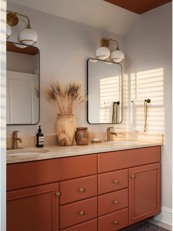
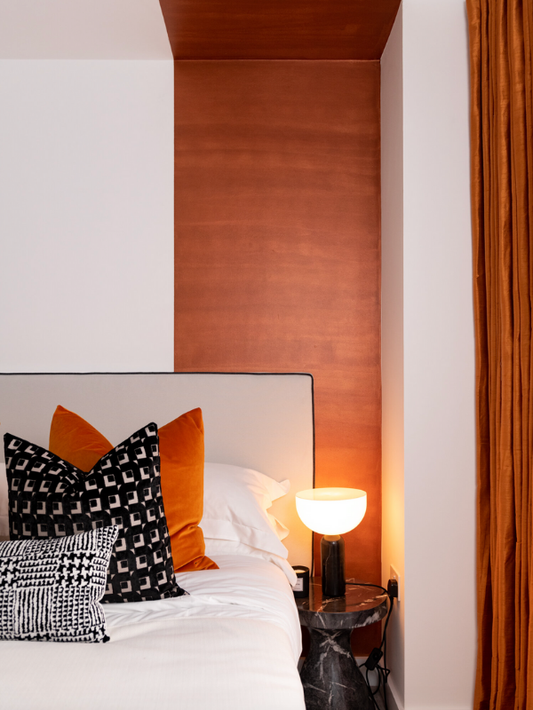
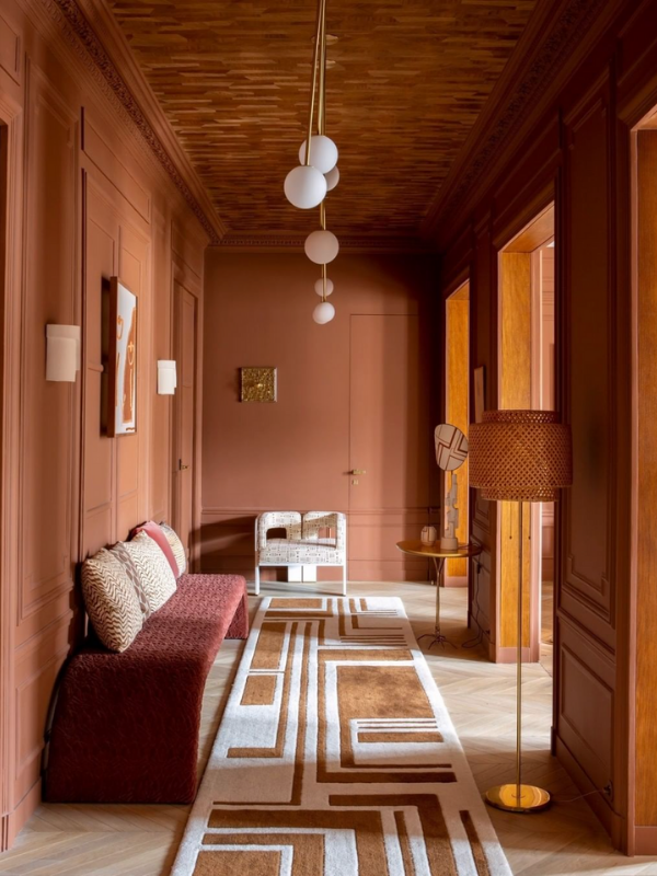
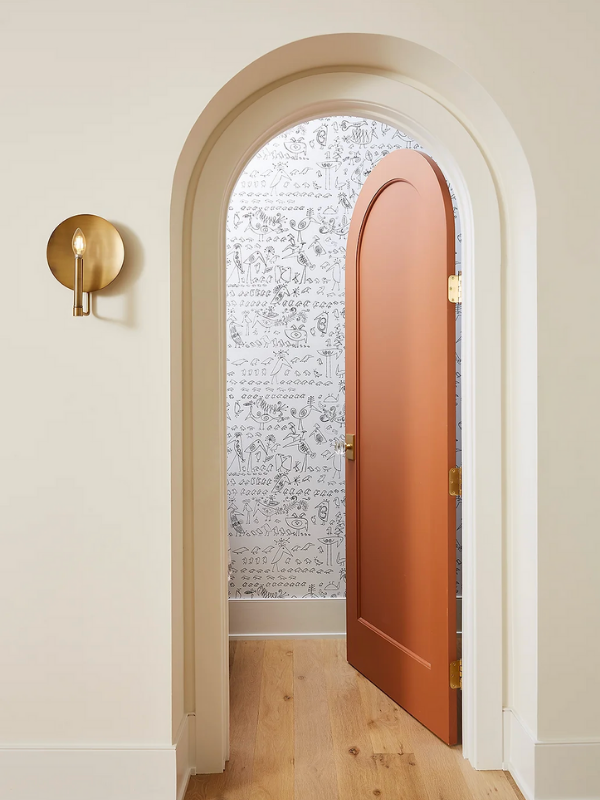
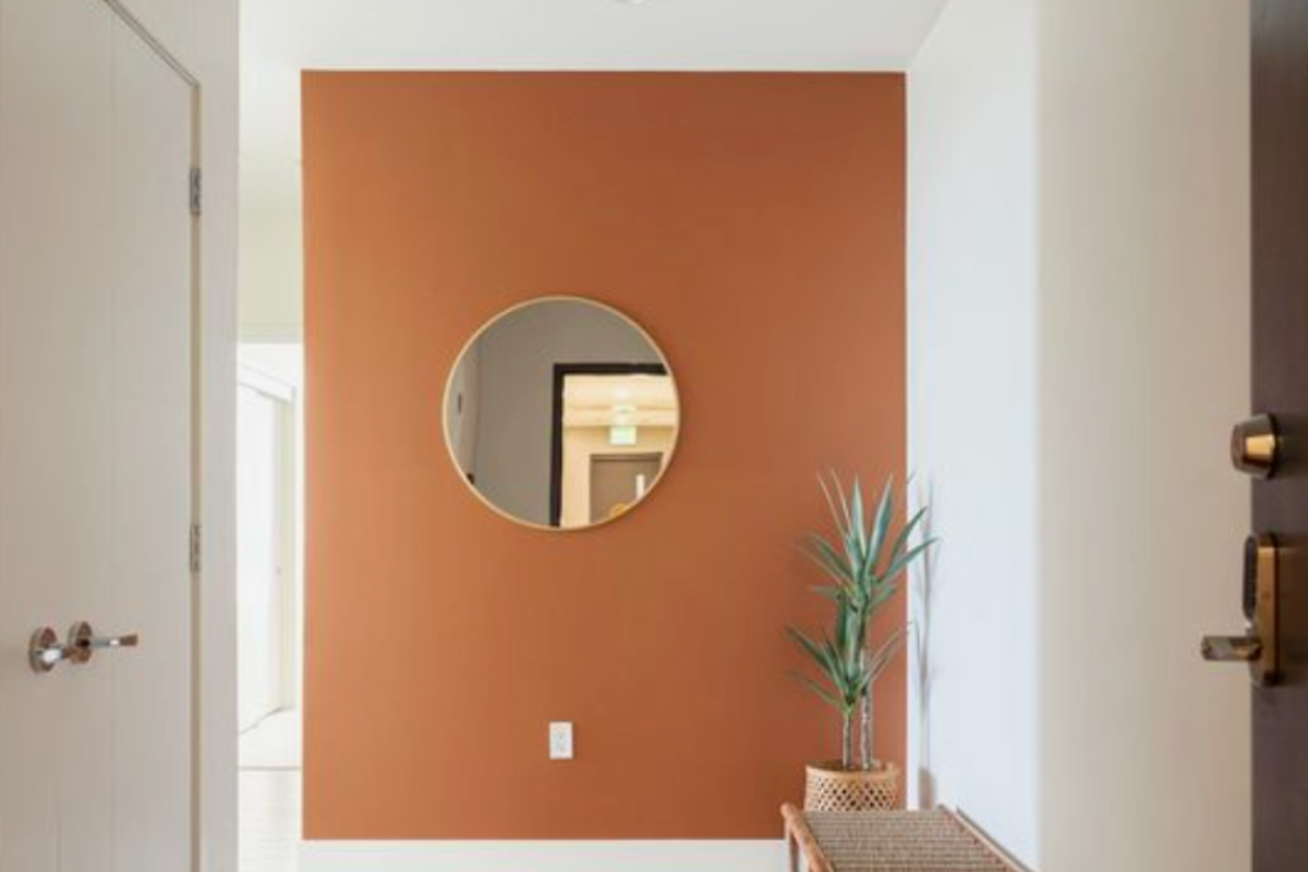
Orange is another vibrant color of the rainbow that offers much more versatility than one might imagine at first glance. The typically bright, citrus shade is bold, enthusiastic, and exudes a fresh take on fun. Softer hues, however, pack a rich history of down-to-earth vibes. From terracotta clay and copper antiques, to worn leathers and rusting metals, hints of orange can be found in very grounded and worldly designs. Its warm tones are popular in bohemian decor and sandy, sun-kissed color palettes offering a more saturated alternative to tan and beige. You can spice up your space with dashes of turmeric, paprika, cayenne, and cinnamon!
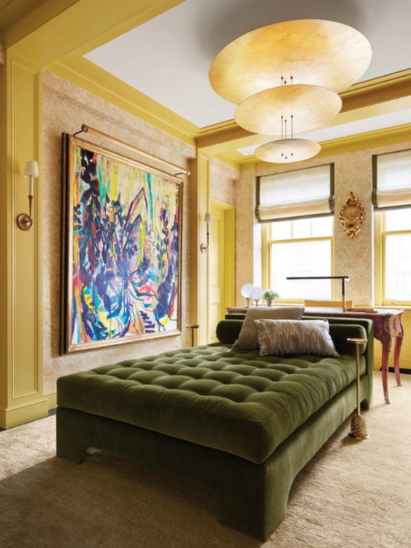
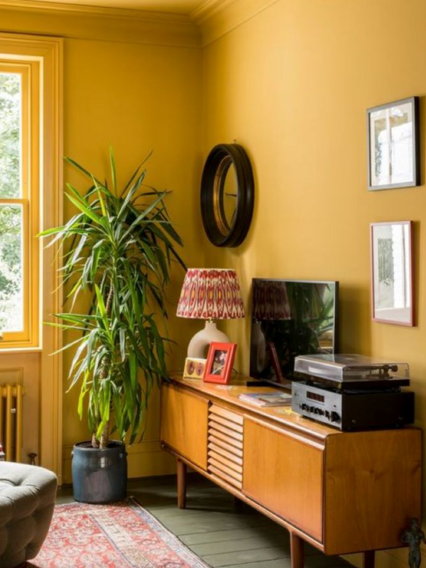
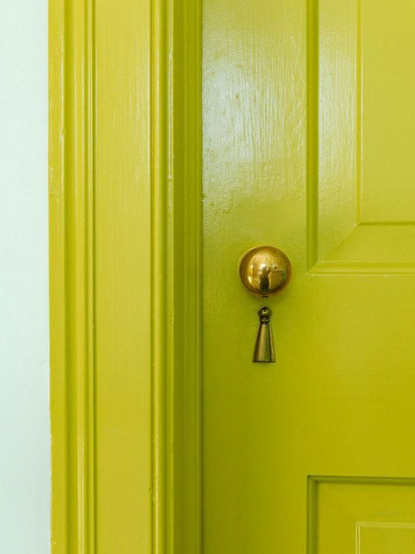
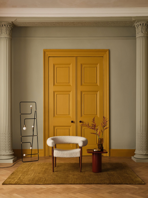
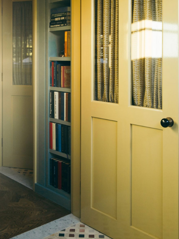
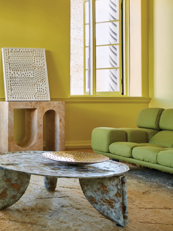
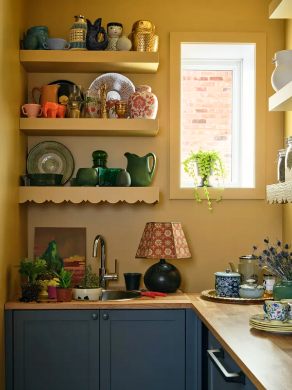
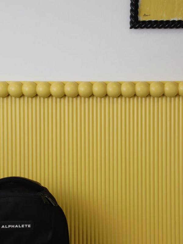
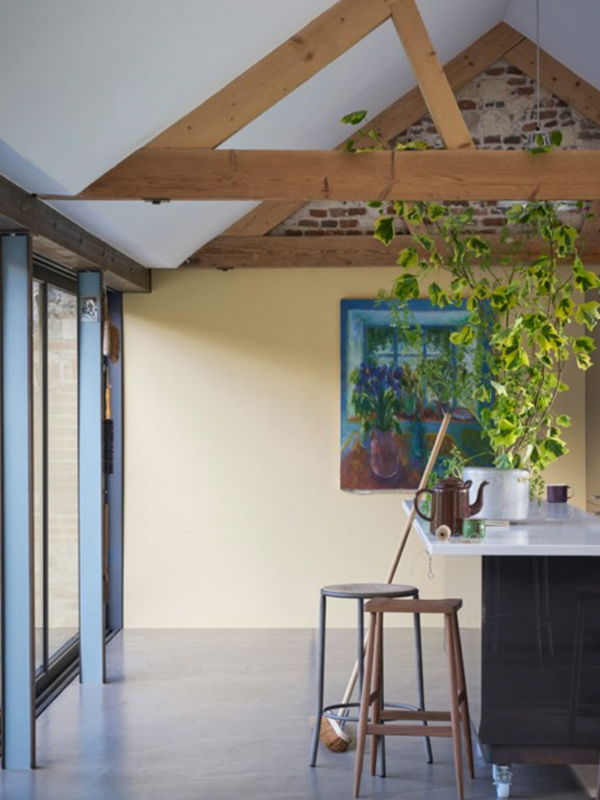
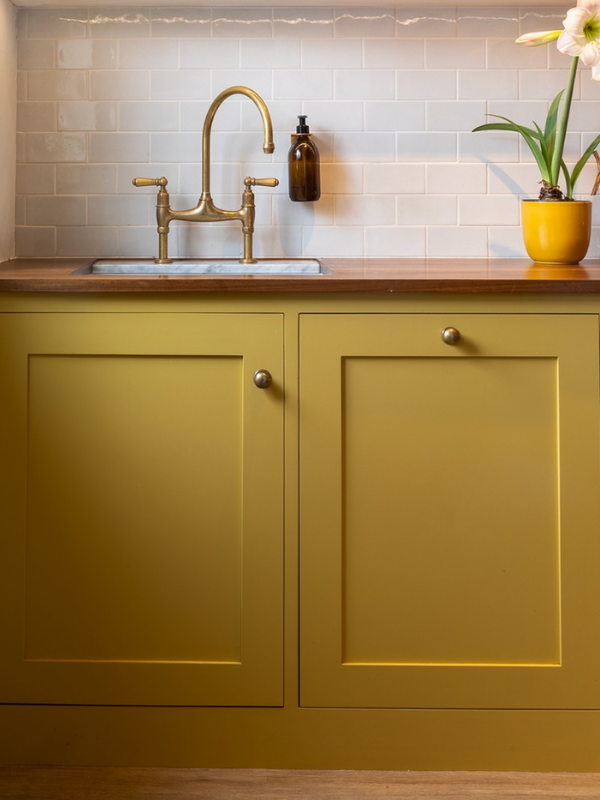
Here comes the sun! Bright and cheerful shades of yellow are known to radiate happiness, joy, and literal sunshine. It is undeniably warm in both appearance and the friendly feelings experienced. From juicy lemons, to ground mustard seeds, to dry hay bales, yellow has a natural connection to Mother Nature's earthy palette while simultaneously offering a vivid contrast. Golden rays glow through woven fiber materials and raw wood tones while saturated accents of canary and chartreuse highlight its more exuberant side of the spectrum. Beams of this carefree color welcome optimism, creativity, and an extra zest to your home and life.
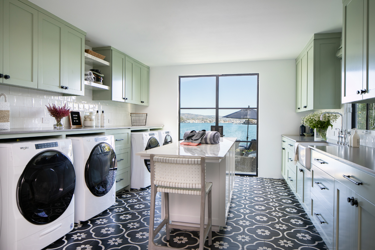
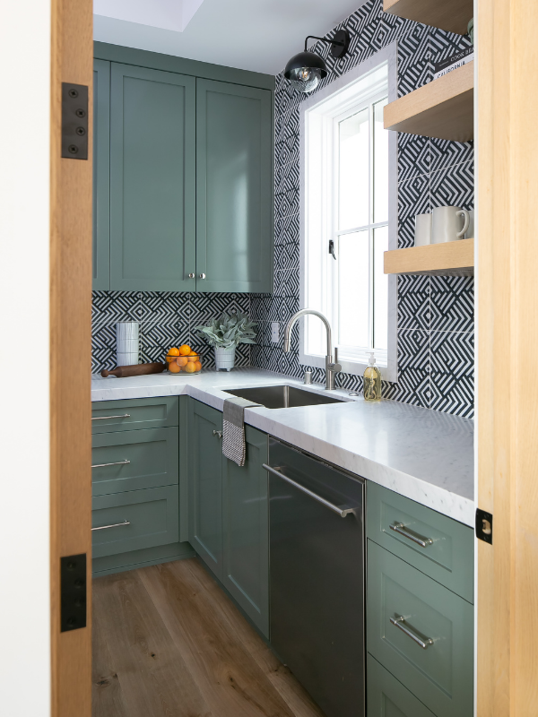
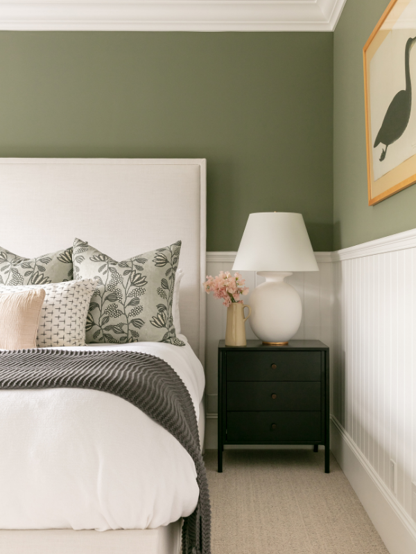
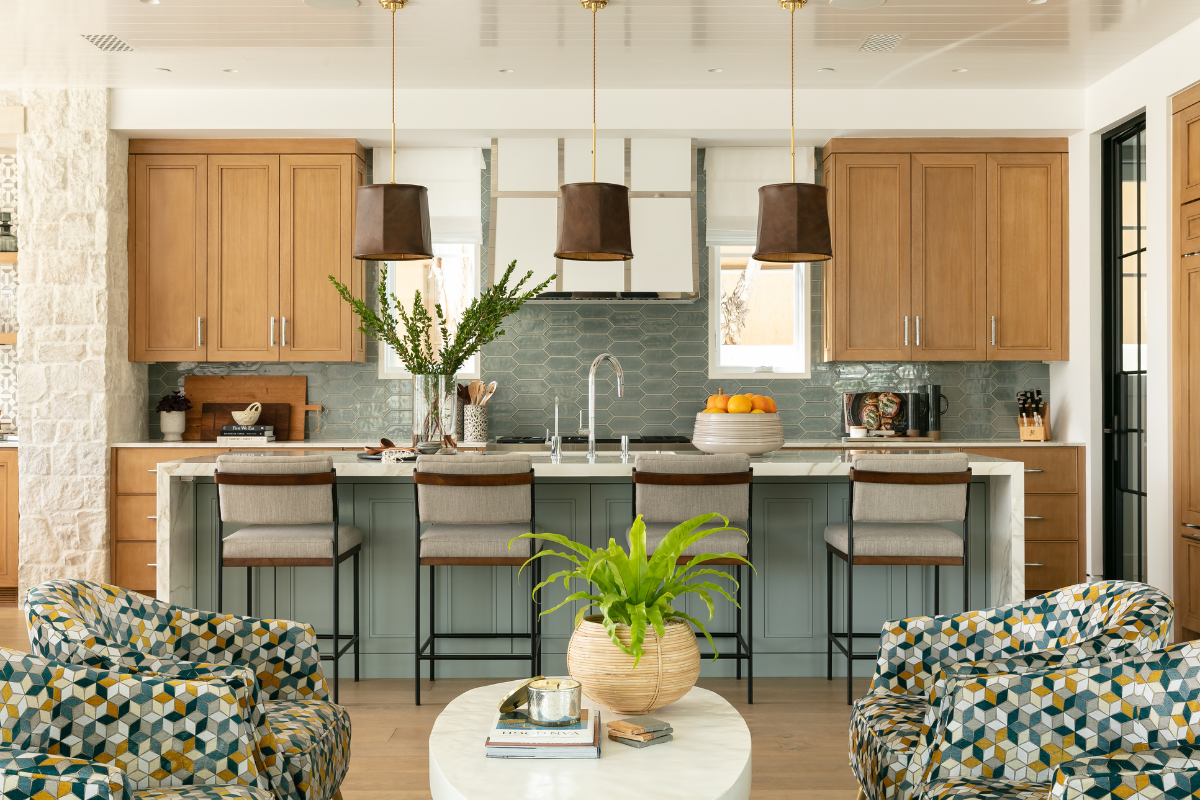
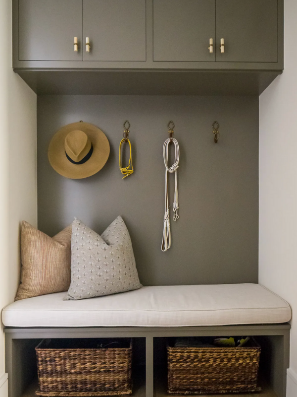
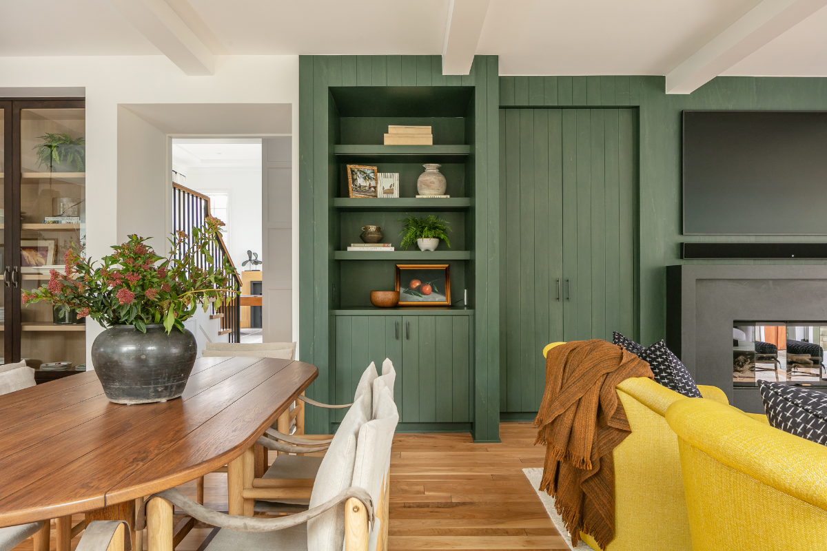
Entering the cool side of the color wheel - next we have green! Its fresh, grassy hues are synonymous with nature and a popular choice for bringing the outdoors in. Lush landscapes come alive with a range of foliage characterized by the plant varieties, current season, and local climate… a versatile palette to lean into for your own home. Deep shades of forest green add depth and sophistication (think luxurious emeralds), mid-tones of flourishing meadows manifest growth, and the dusty, sun-beaten colors of drought-tolerant succulents offer a mild alternative with mighty healing powers. There's stability to an evergreen color scheme, yet a refreshing sense of new beginnings and renewal. The natural beauty of life-giving gardens can saturate your walls with feelings of harmony, calmness, and rejuvenation.
Looking for an even more natural connection to green hues in your home? A wood stain allows the grain patterns to show through and offers subtle variation in the color coverage. We love how this custom stain turned out for the entertainment wall in our Napa Valley meets Newport Beach renovation.
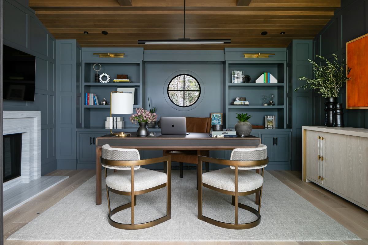
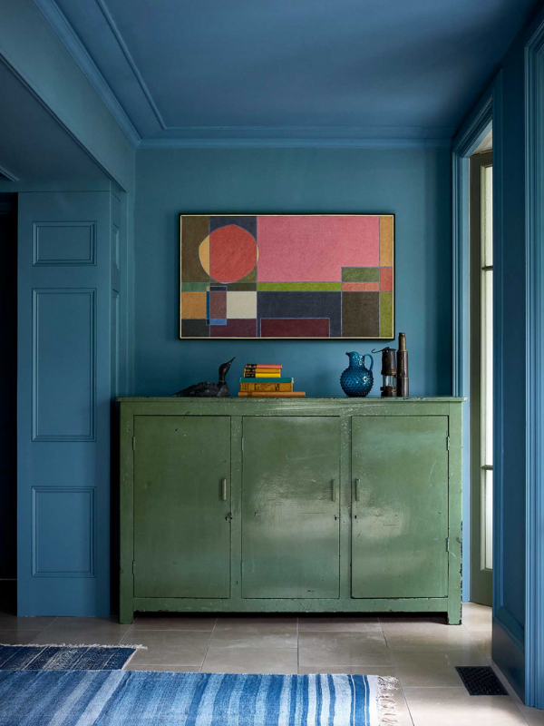
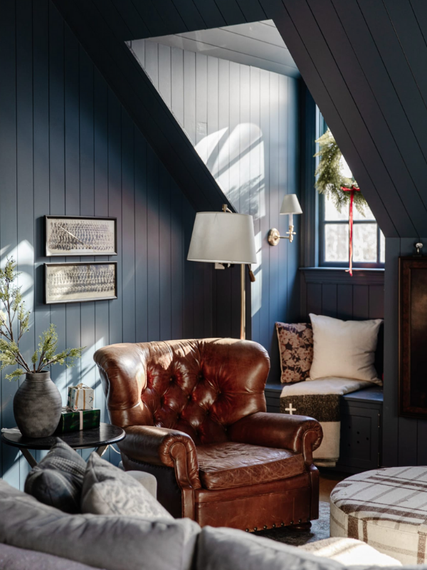
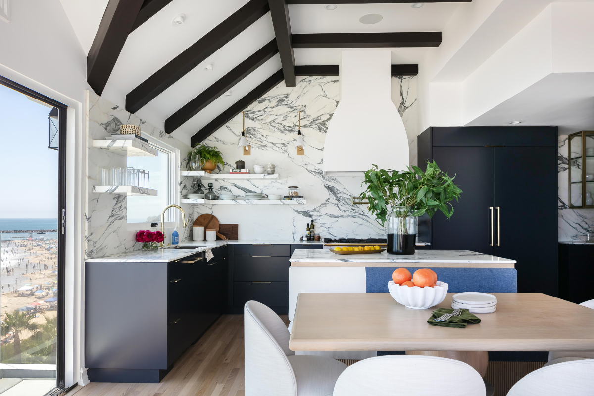
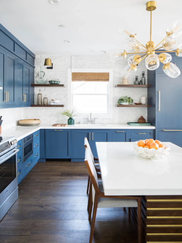
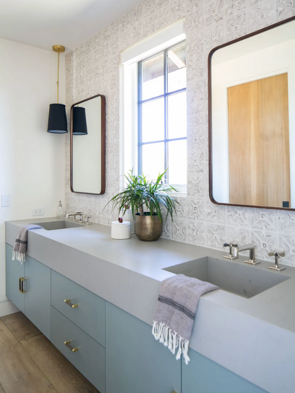
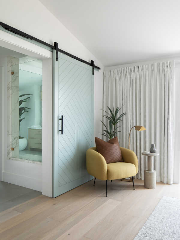
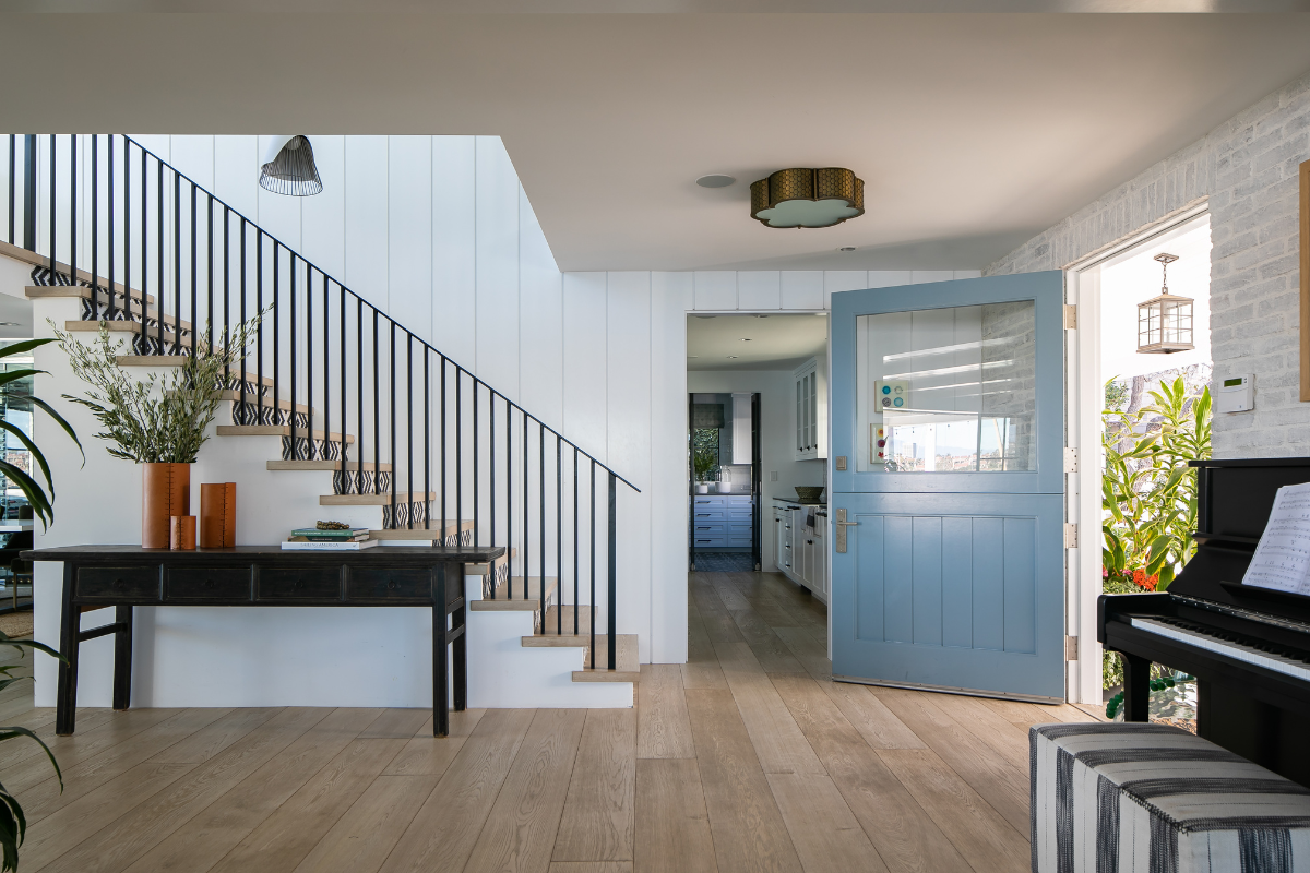
Blue is basically a neutral in our coastal environment. With its clear connection to the sea and sky, it's a go-to for colorful cabinetry and home accents in Southern California. Splashes of deep ocean blues and turquoise waters aren't limited to beach houses and coastal cottages though. In general, blue represents freedom and imagination opening possibilities for blue interiors anywhere and everywhere. From rich indigos and nautical navys to bright royals and soft powders, there are infinite shades of blue that can offer a breath of fresh air in your home. In addition to skylines and seascapes, blue hues may also be one of the more popular and approachable color choices for its relation to trust, loyalty, and confidence in business and commercial context. Even the timelessness of denim makes blue a classic, familiar, and long-loving style to flaunt.
6. EGGPLANT, JAM, FIG... YUM!
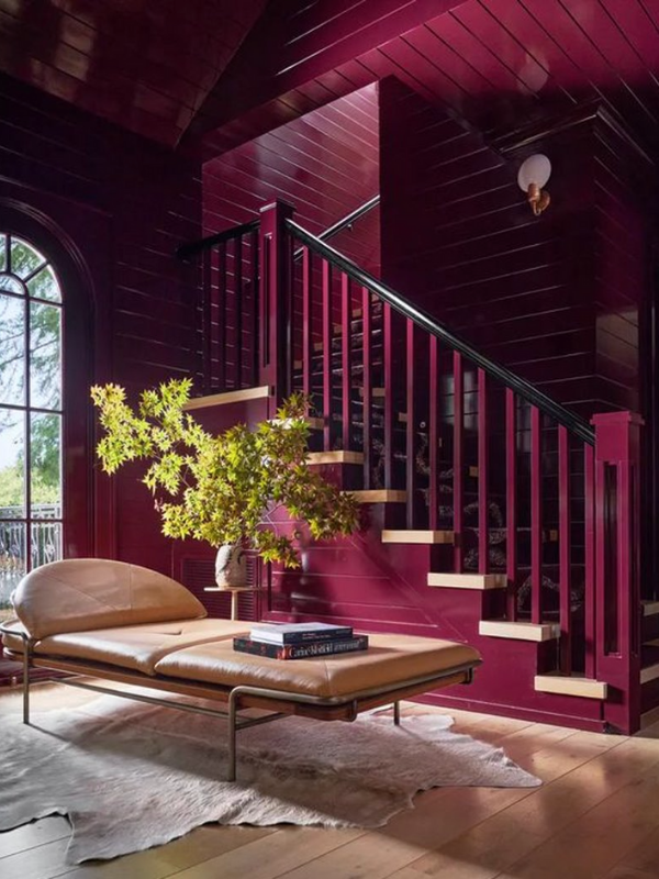
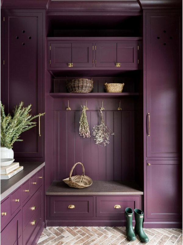
Straying from ROY G. BIV's traditional colors of the rainbow (red, orange, yellow, green, blue, indigo, violet), we've chosen to showcase purple. Purple is not included in the rainbow spectrum because it doesn't have its own wavelength (yes, we Googled that for a refresh of highschool science class), but is rather a mix of red and blue light. We love purple for this complexity! Unique blends of blues, reds, pinks, and browns create sweet and savory shades of berry, eggplant, jam, and fig - just as beautiful on walls as they are tasty on the tongue! Plum is another juicy option that Wendy handpicked for her own dining room chairs fabric after striking out with clients on using the moody color. While lighter tones of lilac and lavender can surely have their place in more delicate designs, it's the deep and saturated jewel tones that are prominent in our home presentations.
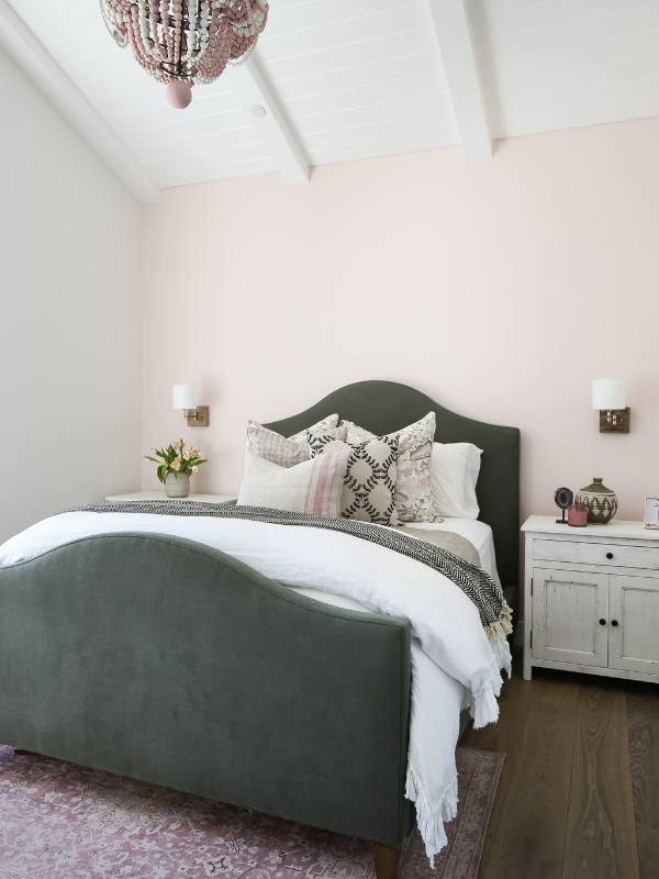
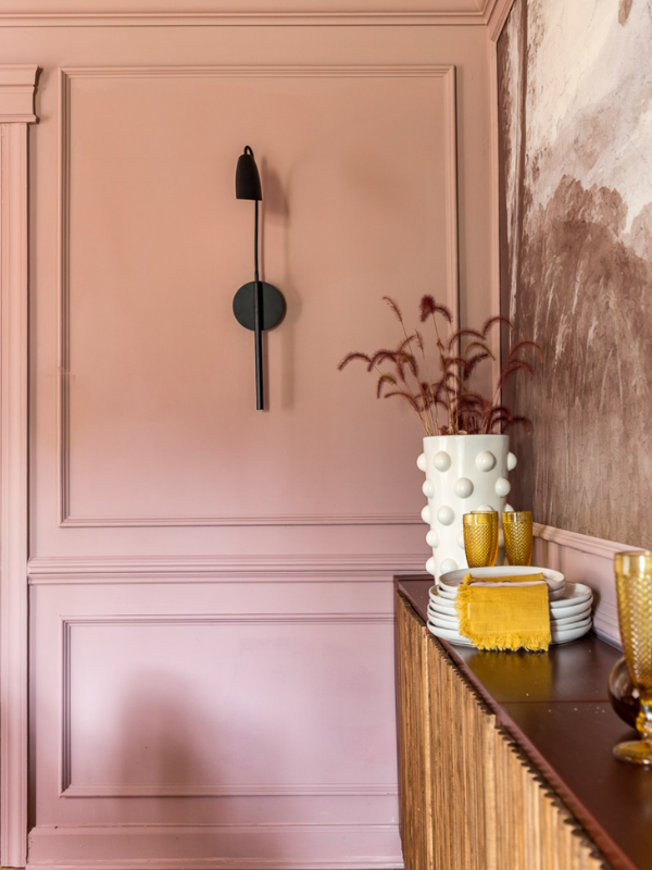
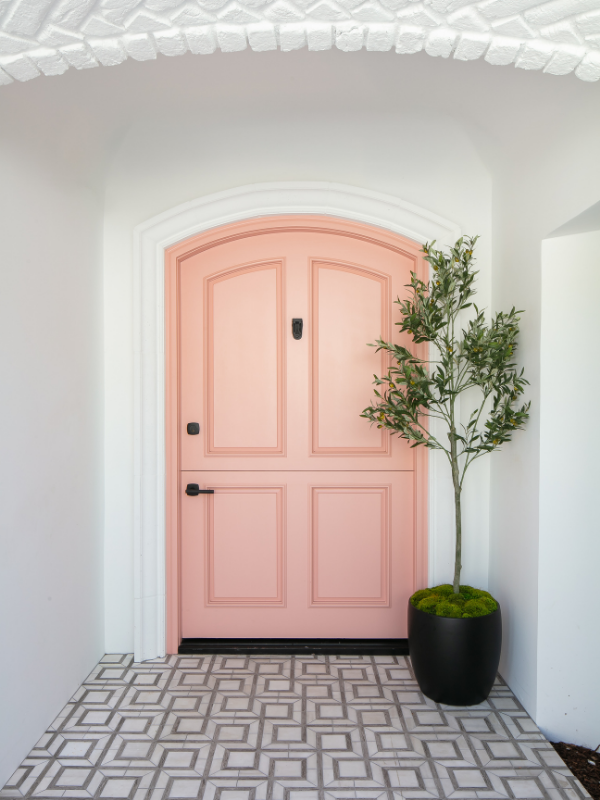
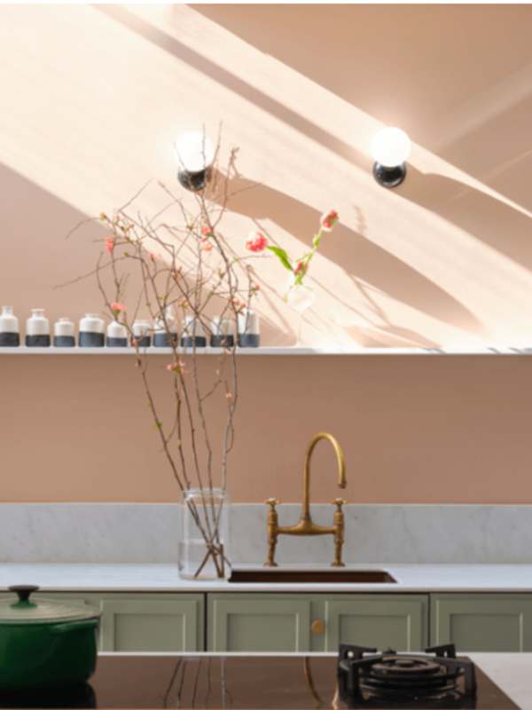
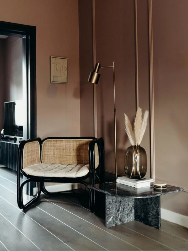
Painting it pink can be just as flirty and fun as it sounds! Playful pops of the stereotypically feminine color may bring Barbie to mind and especially in this season of Barbie mania, that would be no surprise. Lively and whimsical shades of pink are reminiscent of young memories enjoying the simplicity of toy dolls and make-believe and fairy dust, but pink goes beyond those girly, childhood years. Vibrant magentas and high fashion pinks make bold statements on sophisticated stars on and off the runway, while preppy, freshly-pressed shirts invite men into the narrative. Pink isn't just to wear though, Barbie had it right with her Dream House! Rooms of rosy hues and rouges offer a lot to love in a sophisticated home design. Softer hues of blush and mauve give a peek of pink in more neutral settings. Raise a glass of rosé with us and let's toast all the possibilities of PINK!
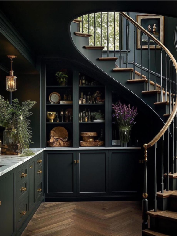
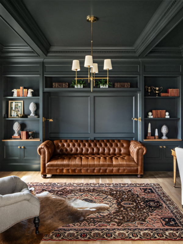
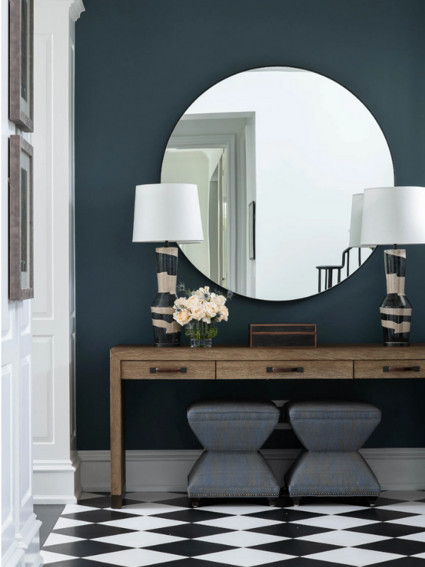
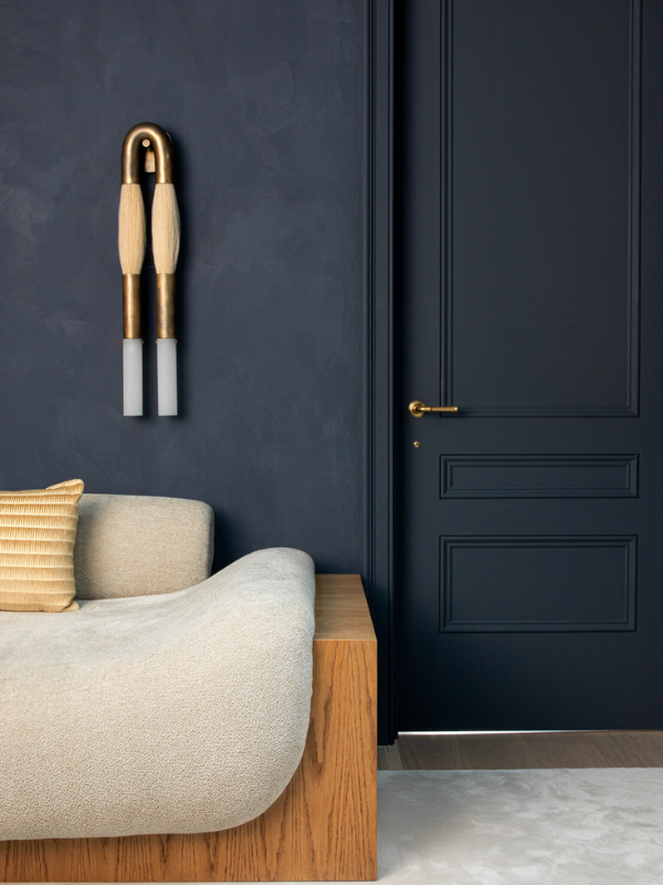
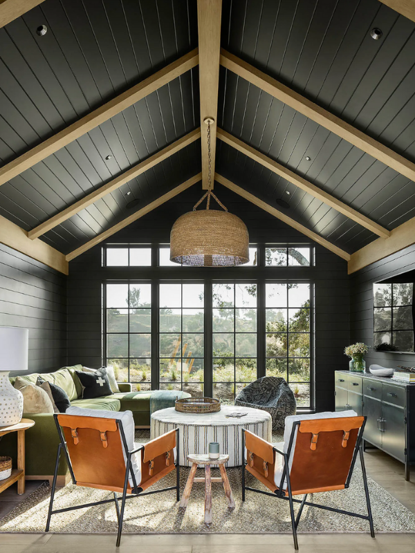
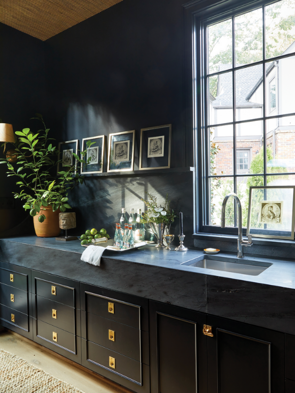
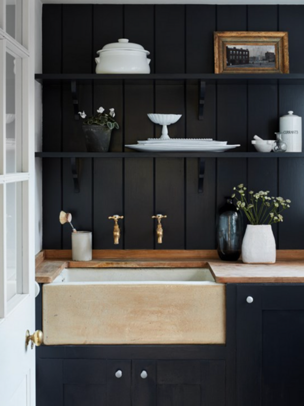
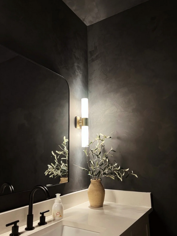
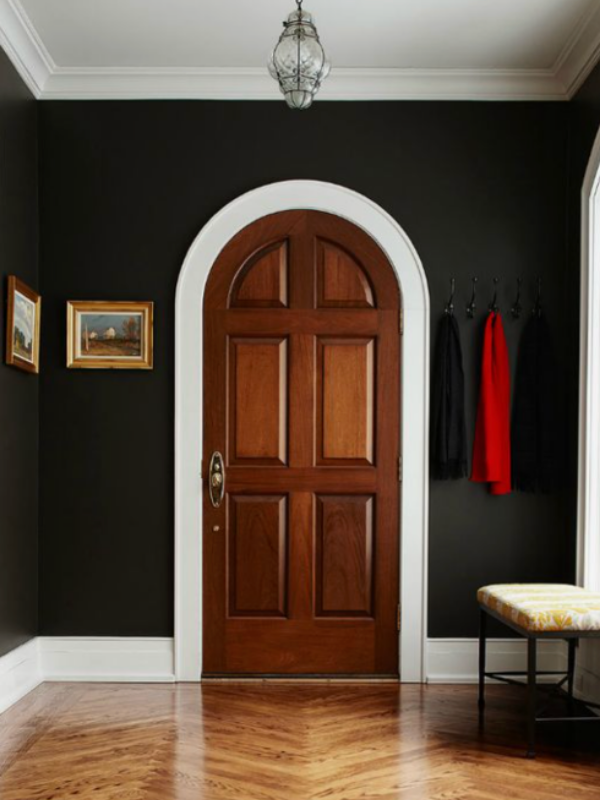
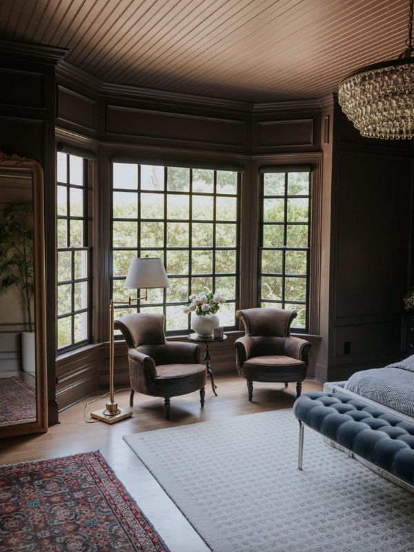
The dark side of the color conversation leads to black. It's the ultimate choice when it comes to moodiness, mystery, and an overall power move. The darker any color goes, the more intimate it makes a space feel, so opting for black is like adding that cool leather jacket as you walk out the door. As with most colors for home design, we're drawn to the "off" versions of the true colors. Jet black may make for an incredibly cool, lacquered glamour, but it's the shades with more variation like midnight, onyx, and ebony that amp up the sophistication level.
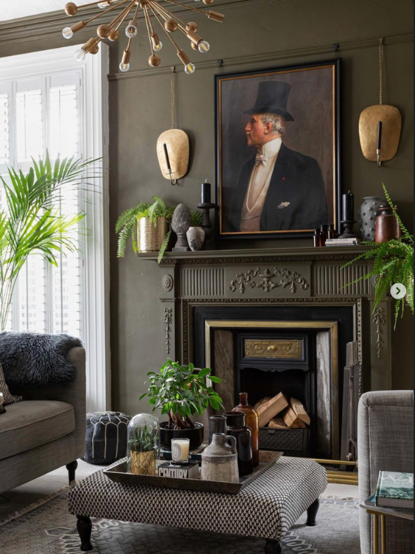
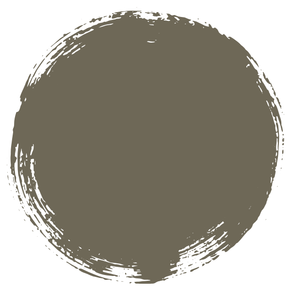
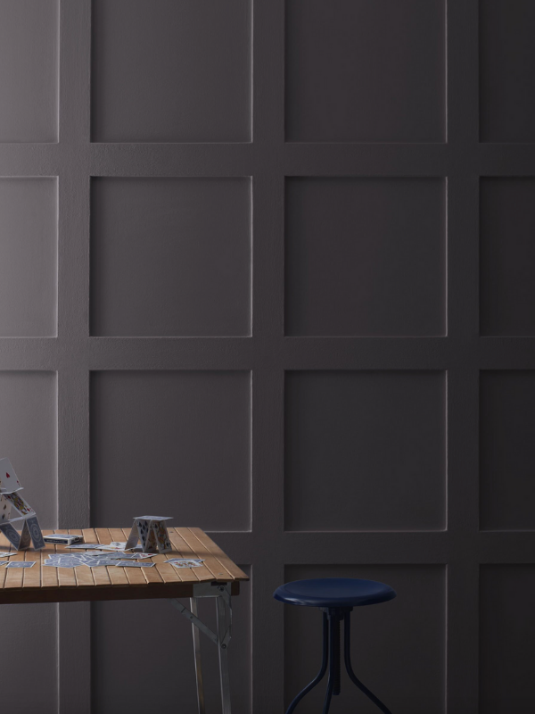
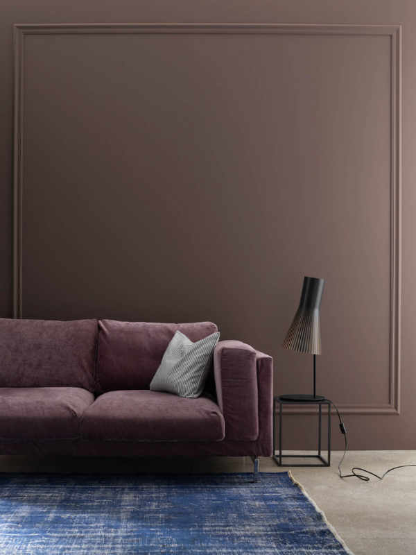
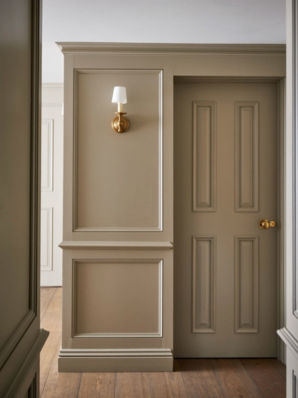
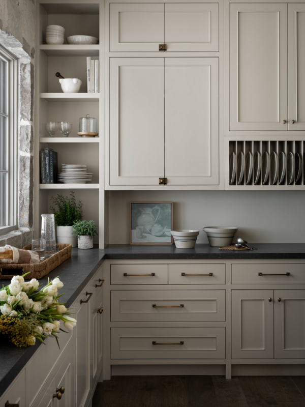
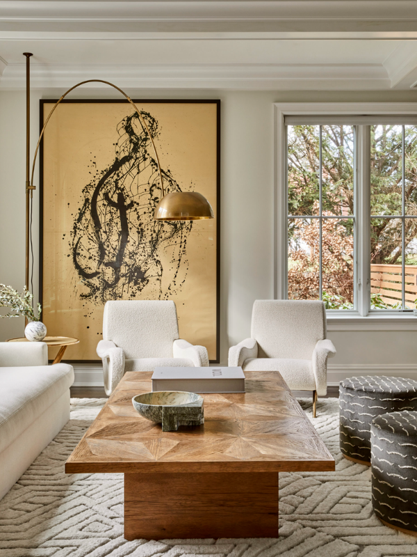
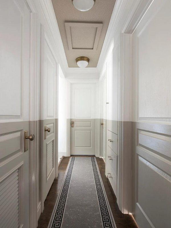
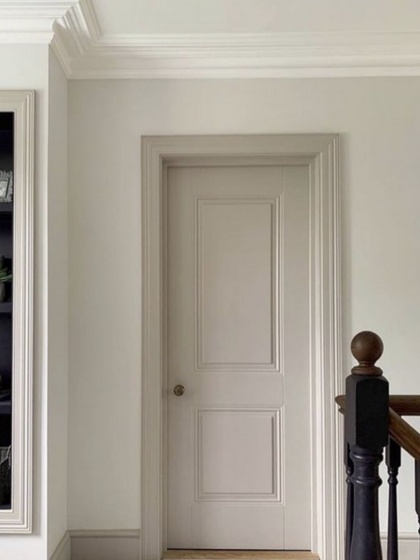
Warm shades of browns and taupes are all over home design. They were in "back when" (until they "weren't") and they're definitely having a moment now! The natural, earthy color ranges from deep chocolate tones to soft shades of beige, with our favorite variations of taupe laying in the middle ground. The hazy neutral offers a clean canvas for millwork and cabinetry without the stark contrast of white. Pairing the muted tones with bright whites and vibrant colors is however a juxtaposition we love to see. The brown family is versatile in the sense that it can be the backdrop of vibrant depth or blend in with its surroundings. The compounded qualities of the muddy color complements the natural elements in a home like wood and stone creating serene environments of calmness. Lighter shades of taupe can tip towards greige (the popular blend between gray and beige) but it's the golden blonde undertones that set it apart.
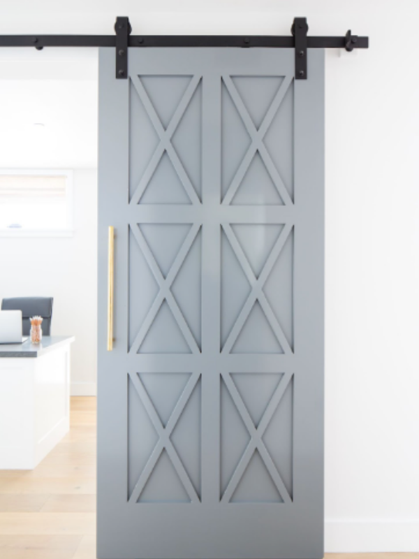
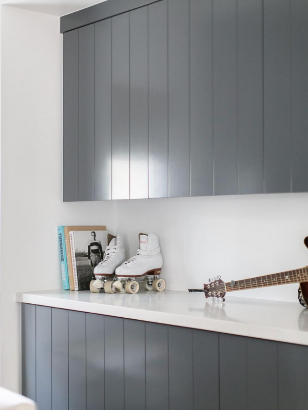
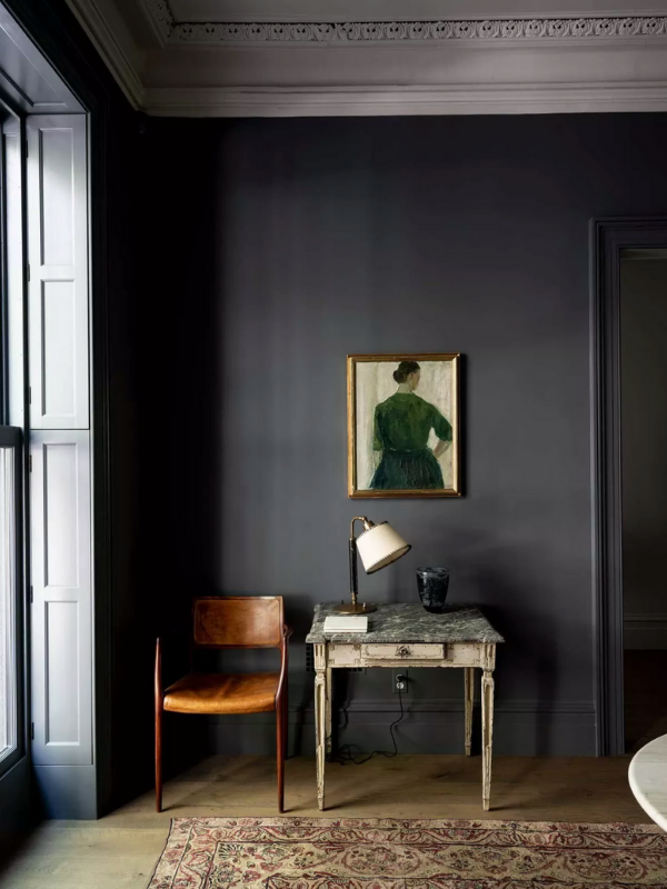
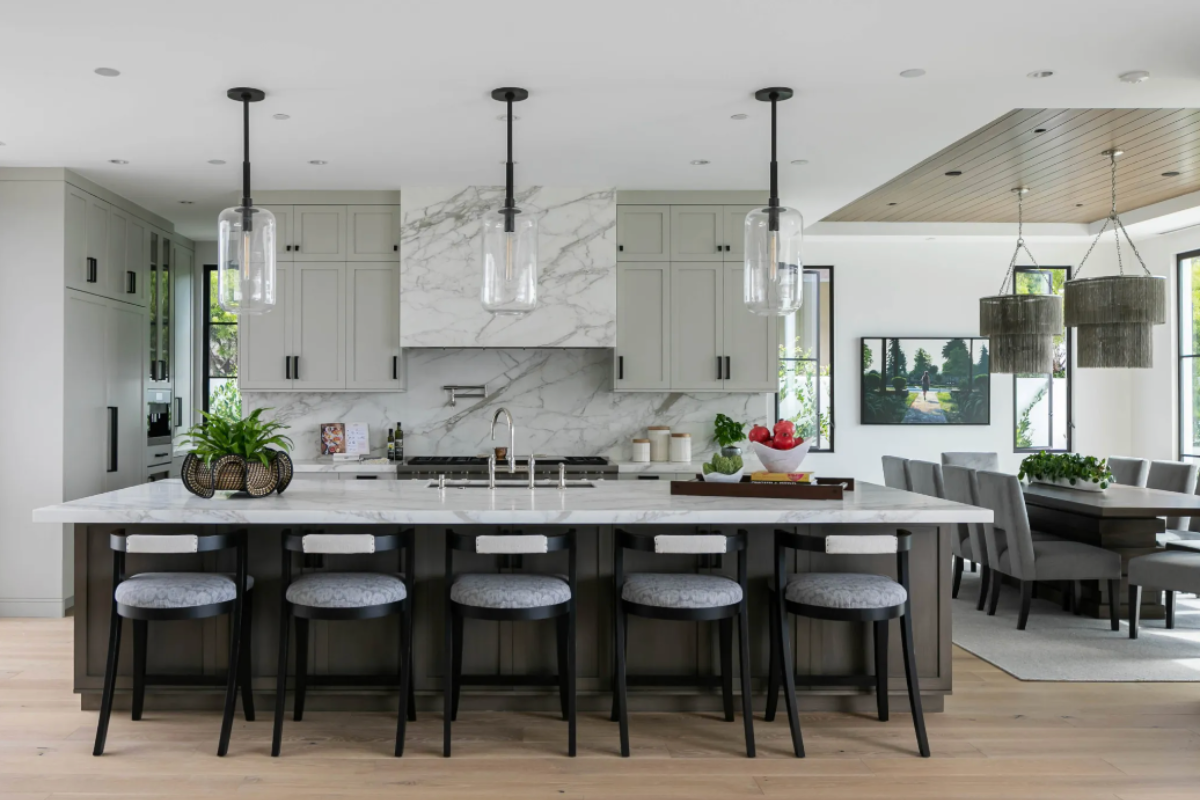
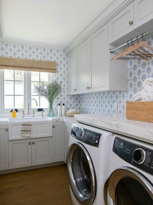
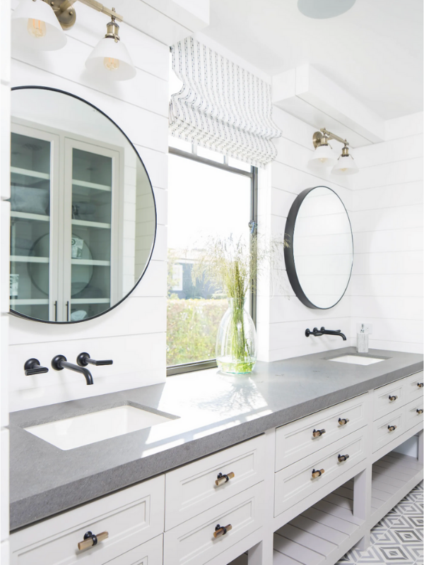
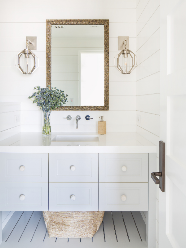
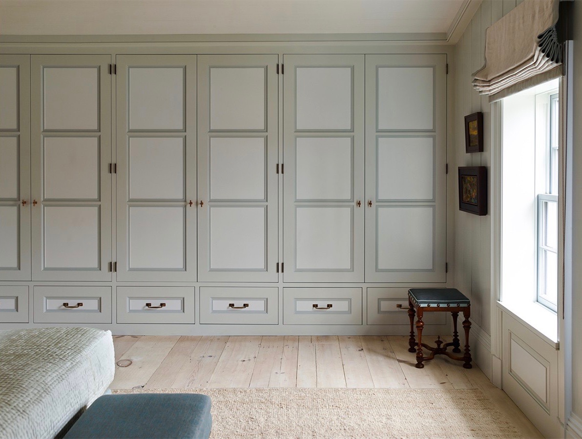
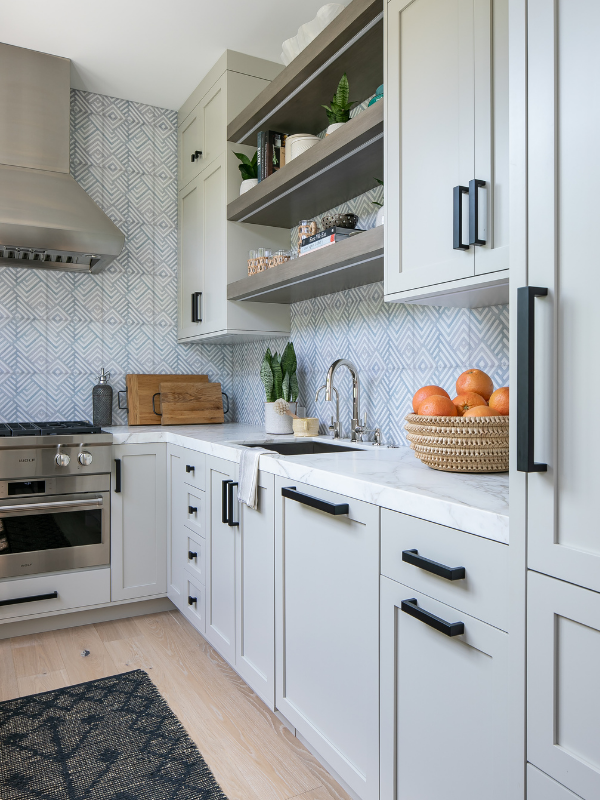
Sometimes it's the smallest amount of color that fits the bill. Not completely absent of color as white is, but as close as it gets! Soft, pale, light hues of grays and tans warm up a space with more depth and calmness and offers an escape from the harsh bright whites. In our design minds there's nothing neutral about neutral.

